

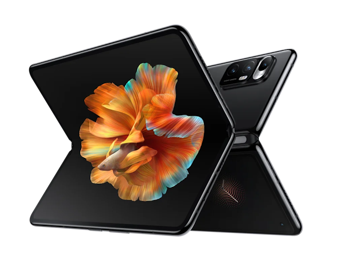
Xiaomi revels their new logo at the company's 'Mega Launch Event' at the same time announced its new foldable Mi Mix Fold, spending more than 20 minutes describing the process in which it turned its old square design into an almost unrecognizable shape.

“Are you disappointed at this logo, that we just made our original logo rounder?”, Lei explained, as the company “didn’t just change the shape from square to round” but also changed “the internal spirit as well as the mentality of the brand.”
Also read: Xiaomi introduced revolutionary Mi Air Charge Technology
 |
| Pic Credit: Xiaomi |
The new logo is designed by famed Japanese designer Kenya Hara. According to Hara, the team used the power of mathematics to try to find the perfect middle ground between a square and a circle. In the end, out of twenty-four options, the team opted for shape n:3. Whether or not n:3 looks more 'alive' than the rest is up to you. “The new logo is not a simple redesign of the shape but an encapsulation of Xiaomi’s inner spirit,” said Hara during a video segment.
Also read: Samsung develops 512GB DDR5 memory module for advanced computing


0 Comments